You have looked at data in lists, histograms, stem-and-leaf plots, measures of central tendency and measures of variance. Another way to have a quick look at the measures of variance is to create a box plot for the data.
A box plot (sometimes called a "box and whiskers plot") uses a number line and a box to show the 5 number summary: the minimum, Q1, median, Q3, and the maximum.
Steps for Creating a Box Plot
Find each of the following: minimum, maximum, median, Q1, and Q3.
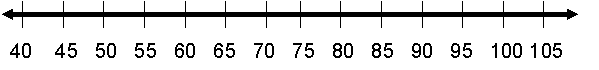
Make a number line large enough to contain the minimum through the maximum.
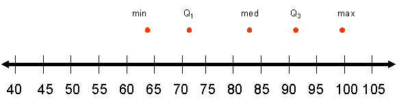
Mark each of the five numbers you found above the number line.
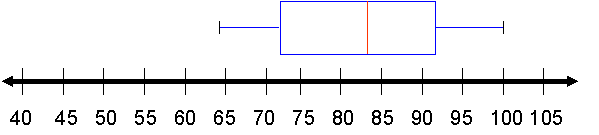
Draw a box from Q1 through Q3.
Draw a vertical line in the box for the median.
Draw a whisker on each end to the minimum and the maximum.
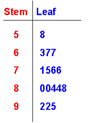
Example 1: Draw a Box Plot
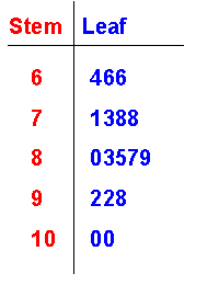
The numbers in the stem-and-leaf plot show the scores that Mr. Arnold’s first period science class earned on their most recent exam.
Find the minimum, maximum, median, Q1, and Q3. Then make a box plot to represent them.
Minimum = 64
Maximum = 100
Median = 83
Q1 = 72
Q3 = 92
The number line will run at least from 64 to 100. It is usually a good idea to make it a little larger.
Next, draw a mark above the line for each of the numbers found.
Then, draw a box from Q1 to Q3, and draw a vertical line in the box at the median. Finally, draw whiskers to the minimum and maximum.
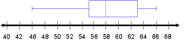
Example 2: Interpret a Box Plot
Estimate the minimum, maximum, median, Q1, and Q3 from the box plot below.
Minimum = 46
Q1 = 55
Median = 58
Q3 = 63
Maximum = 66
Example 3: Finding an Outlier, Visually and Numerically
Use the information you found in Example 2 to find the outlier for the box plot above. Use the visual of the box plot to guess, and then numerically find it using the technique from the previous lesson.
Visually, an outlier would be a number at the end of an extra long whisker. Here’s why:
Looking at the box and whiskers plot above, you can see that the left whisker is somewhat longer than the box.
The length of the box is the inter-quartile range.
The length of the whisker may be close to one and a half (1.5) the length of the box, so 46 may be an outlier.
Now, use the steps to find an outlier.
Interquartile range = Q3 – Q1 =63 – 55 = 8
1.5(8) = 12
Q1 – 12 = 55 – 12 = 43 and Q3 + 12 = 63 + 12 = 75
Forty-six is not quite an outlier, but it is close.
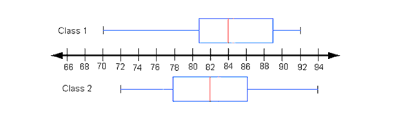
Quick Practice
Use the two box and whisker plots above to answer the following questions.
What are the minimum, maximum, median, Q1, and Q3 for each class?
Class
Minimum
Maximum
Median
Q1
Q3
Class 1
70
92
84
81
89
Class 2
72
94
82
78
86
Which class has the highest score?
Class 2
Which class has the lowest score?
Class 1
Which class has the smaller range?
Same
Which class has the higher median?
Class 1
Which class has the higher first quartile?
Class 1
Which class has the higher third quartile?
Class 1
The better set of scores over all?
More of the scores are higher in Class 1 than in Class 2 which is indicated by the box part of the plot.
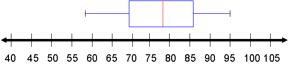
Create a box plot for the following data:
Values:
Minimum
Maximum
Median
Q1
Q3
58
95
78
69
86
Box Plot:
Quiz 5 (10 points)
It’s time to complete your homework. Find the Section 6 Homework link to submit for a grade. You may do this only one time, so check your understanding of the material before completing your homework, and do your best.
Congratulations! You have completed Unit 6. Study for and take the Module 6 Exam (100 points). Click "Solving Systems" and find the 6-ModuleExam link to submit for a grade.