Many students look at a histogram and think they are looking at a bar graph. They are very alike, but a histogram is actually a little more versatile. You can represent groups of numbers (intervals) with each bar.
Here is an example:
Let’s say that your class was given a 100-point statistics quiz and you wanted to make a histogram of the results to get an idea of how the students scored overall. Steps for Creating a Histogram
Step 1: Consider the raw data
Here are the raw scores from my first period class.
92, 85, 79, 88, 76, 51, 79, 79, 64, 82, 73, 81, 79, 62, 87, 96, 65, 71, 82, 78, 98, 90, 73, 59, 80, 78, 60, 79, 85, 80
Step 2: Decide on the intervals you will use
Before you make the histogram, decide how you want to group the scores. The reason for grouping them is that 51 bars are too many for a graph. You may want to look at them by grade range, and in your school, the grades are divided up the way you see them in the table below. Another way to do this may be to group by fives instead of tens. But that will double your number of bars and may be difficult to handle.
Step 3: Create a frequency table
A frequency table will organize your data for graphing. You can use a tally to mark off a number as you use it in each group. The word “frequency” refers to the number of values in the interval.
Intervals
Tally
Frequency
F 50-59
| |
2
D 60-69
| | | |
4
C 70-79
| | | | | | | | | | |
11
B 80-89
| | | | | | | | |
9
A 90-100
| | | |
4
Total
30
Step 4: Draw the histogram
The intervals will run along the horizontal axis.
The frequency will be vertical.
Label each axis.
Give your graph a title.
When you draw the bars, connect them, like you see below.
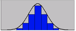
One of the things you can tell from looking at a histogram is its distribution. The data is usually described as being distributed normally, positively or negatively.
Types of Distribution
Normal Distribution- the data forms what is called a bell shaped curve.
Positively or Negatively Skewed- the data is pulled in one direction away from the center.
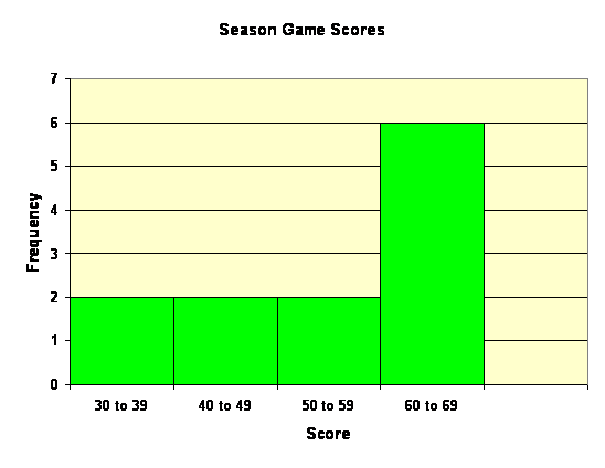
Example 1: Find Information from a Histogram
Use the histogram to determine each of the following.
Where does the median occur?
Just looking at the histogram, it appears that the middle should be in the 70-79 interval. But you can check this.
There are two in the 50-59 interval.
There are four in the 60-69 interval.
There are 11 in the 70-79 interval.
There are nine in the 80-89 interval.
There are four in the 90-100 interval.
Since there are 30 numbers total, the median will be between the fifteenth and sixteenth numbers. The seventh through eighteenth appear in the 70-79 interval, so the original guess was right.
What is the distribution of the data?
Description:
The largest group of students scored in the 70 to 79 range.
Most students passed the exam if passing is 60 and above.
This is close to a normal distribution.
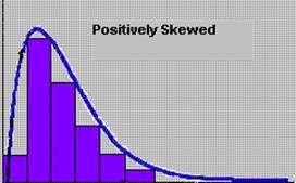
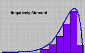
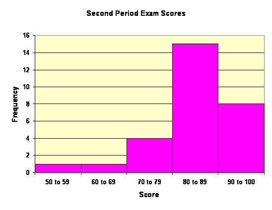
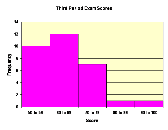
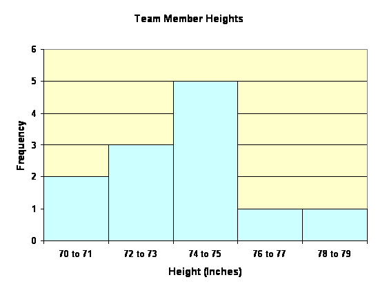
Example 2: Comparing two Histograms
These two histograms show scores from the second and third period classes.
Describe the distribution of each.
The second period distribution is negatively skewed.ĀThe largest group scored in the 80 to 90 interval.
The third period distribution is positively skewed.ĀThe largest group scored in the 60 to 70 interval.
Which has the greater median?
It appears that the median of the second period will be in the 80 to 90 interval and the median of the third period will be in the 60 to 70 interval.ĀSo the second period would have the greatest median.
In the first semester, you learned how to make a stem-and-leaf plot. Let’s review those here.
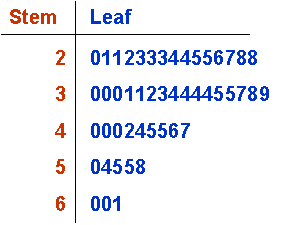
Example 3: Review of Stem-and-Leaf Plots
A Broadway theater conducted a survey, for advertising purposes, of the ages of groups attending the plays. This is a random sample for one evening.
20 21 21 22 23 23
23 24 24 25 25 26
27 28 28 30 30 30
31 31 32 33 34 34
34 34 35 35 37 38
39 40 40 40 42 44
45 45 46 47 50 54
55 55 58 60 60 61
First, use the data to create a stem-and-leaf plot.
Find each of the following and round to the nearest whole number.
Find the mean of the theater data.
Find the median.
Find the mode.
Which measure of central tendency best describes the data?
To find the mean, add all of the data and divide by 48.
1739/ 48 ≈ 36.
To find the median, average the two middle numbers. These will be the 24th and 25th numbers. This is easy to find by counting the leaves. Since these two numbers are 34 and 34, the median is 34.
The mode is 34.
Since the 30s are the largest age group, with the 20s close behind, the median and mode are the best measures of the data.
Quick Practice
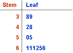
The following data represent the scores for the 6th grade basketball team this season. Use the data to create a stem-and-leaf plot. Then find the mean, median, and mode for the team.
61, 38, 55, 65, 66, 42, 61, 48, 50, 39, 62, 61
Plot:
ĀĀĀĀĀ Mean: 54, Median: 58, Mode: 61
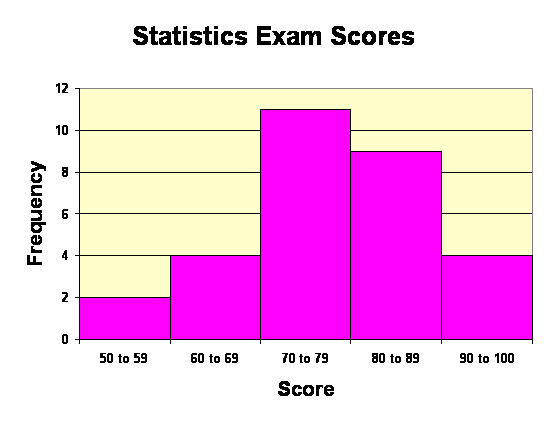
Make a frequency table for the team, with intervals of 30 to 39, 40 to 49, 50 to 59, and 60 to 69. Then, create a histogram for the data. Note where the mean and median are on the histogram.
Frequency Table:
Interval
Frequency
30 to 39
2
40 to 49
2
50 to 59
2
60 to 69
6
Total
12
The mean and the median are both in the third interval.
The data represents the height, in inches, of members of a high school basketball team. Create a frequency table and histogram for the data. Use intervals of two inches. What is the median height?
70, 71, 72, 72, 73, 74, 74, 74, 74, 75, 77, 79
Table:
Height (in)
Frequency
70 to 71
2
72 to 73
3
74 to 75
5
76 to 77
1
78 to 79
1
The median height is 74 to 75.
Describe the data distribution of problems one through three.
Problem 1 and 2:ĀThere are more scores in the 60s than in any other interval.ĀThe data is negatively skewed.
Problem 3:ĀThere are more players in the 74 to 75-inch height range than any other interval.ĀThe data is close to normal distribution.