Age Structure
Age structure diagrams break down the number of males and females into age groups (such as 25-30 years old, 31-35 years old, etc.) or age categories (pre-reproductive, reproductive, and post-reproductive). The line in the middle of the diagram separates males from females.
Click each picture below to find out more about what age structure diagrams can tell us.
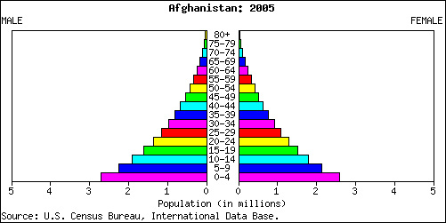
What type of population does this graph represent?
Answer: Rapid Expansion: Populations with a large number of people in the prereproductive category (ages 0-14), like Saudi Arabia, Nigeria, and Guatemala, are poised to expand rapidly as the younger generation begins to have children.
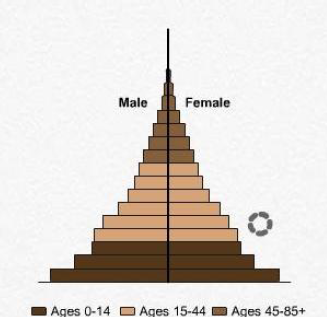
This type of population is found in United States, China and Australia and is known as…
Answer: Slow Expansion: The United States, China, and Australia are slowly expanding because although the number of people in the prereproductive category is larger than other categories, it is not as large as that of a rapidly expanding country.
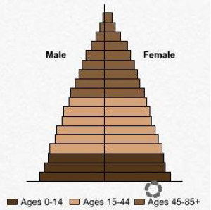
How does the age distribution in countries like Japan, Italy and Greece create stable population growth?
Answer: In countries like Japan, Italy, and Greece, there is an even distribution of age groups where each category (prereproductive, reproductive and post reproductive) is similar in number or size. This results in a stable population growth over time.
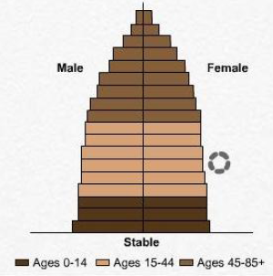
In this age structure chart we see a declining population. These countries have a larger numbers of elderly people than younger people, resulting in a declining population. Where might we see this type of population and what kind of impacts might it have?
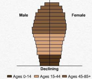
Answer: We can see this in countries like Germany, Bulgaria, Russia and Japan. If the decline is gradual, it generally does not have any harmful effects, but a rapid decline can put pressure on a country’s economic systems. Japan, for example, has a large elderly population who require government-funded health care, social security, and other public services. Who will pay for this as the number of younger people is declining in these countries?
Does this population structure graph represent a developing or developed country?
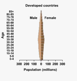
Answer: Developed Country: Developed countries generally have smaller percentages of young people and so their age structure diagrams are fairly slim.
What is happening in developing countries with respect to population structure?
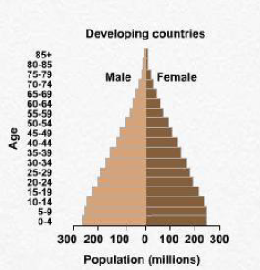
Answer: Developing countries have larger numbers of younger people in their population, resulting in a more pyramidal-shaped age structure diagram and more rapid population growth.
Text Version
- What type of population does this represent?
Rapid Expansion: Populations with a large number of people in the prereproductive category
(ages 0-14), like Saudi Arabia, Nigeria, and Guatemala, are poised to expand rapidly as the
younger generation begins to have children.
- This type of population is found in United States, China and Australia and is known as…
Slow Expansion: The United States, China, and Australia are slowly expanding because
although the number of people in the prereproductive category is larger than other categories, it is not as large as that of a rapidly expanding country. - How does the age distribution in countries like Japan, Italy and Greece create stable population
In countries like Japan, Italy, and Greece, there is an even distribution of age groups where
each category (prereproductive, reproductive and post reproductive) is similar in number or size. This results in a stable population growth over time. - Where might we see this type of population and what kind of impacts might it have?
In this age structure chart we see a declining population. These countries have a larger numbers of elderly people than younger people, resulting in a declining population. We can see this in countries like Germany, Bulgaria, Russia and Japan. If the decline is gradual, it generally does not have any harmful effects, but a rapid decline can put pressure on a country’s economic systems. Japan, for example, has a large elderly population who require
government-funded health care, social security, and other public services. Who will pay for this
as the number of younger people is declining in these countries? - Does this population structure graph represent a developing or developed country?
Developed Country: Developed countries generally have smaller percentages of young people
and so their age structure diagrams are fairly slim. - What is happening in developing countries with respect to population structure?
Developing countries have larger numbers of younger people in their population, resulting in a more pyramidal-shaped age structure diagram and more rapid population growth.
Writing Assignment: Age Structure Diagrams
Age structure diagrams can tell us a lot about the potential for population growth in any given population. Using this worksheet and the any other paint or graphing program you are comfortable with), your task is to use U.S. Census data to find the information needed to complete this diagram. Data for constructing the diagram will come from Census Year 2000 data for the American Indian and Alaska Native group. Because emigration and immigration are not major factors influencing the population numbers for this group, you can see the future of the group’s population without substantial migration influences.
Use 2000 Census Table 3 to gather data for the number of females in each age group for the American Indian and Alaska Native group. Be sure you use the column specified for that group.
Use 2000 Census Table 2 to gather data for the number of males in each age group for the American Indian and Alaskan Native group. Be sure you use the column specified for that group. KUE 3
Using the data you find, draw bars on an age structure diagram to represent the populations for each age group of males and females. Once you have finished constructing the diagram using the whiteboard link, copy and paste it onto the worksheet and answer the follow-up question on the worksheet.
Submit your completed assignment to the Writing Assignment: Age Structure Diagrams link for grading.
*adapted from http://esa21.kennesaw.edu/population.htm
https://www.census.gov/library/publications/2002/dec/c2kbr01-15.html
https://www.census.gov/data/tables/2000/dec/phc-t-09.html
Life Tables and Survivorship Curves
How do you think the population of Galveston, Texas, changed after the devastating hurricane of 1900? Populations grow and shrink, and their age and gender composition changes through time in response to evolving environmental and social conditions. Looking at population growth curves and age structure diagrams is one way to study populations. Another method population experts use is looking at life tables and survivorship curves.
A life table uses information about age- and gender-specific mortality rates to determine patterns of survivorship and life expectancy. Life tables can be constructed in two ways. The first way is to study a cohort, a group of individuals born at roughly the same time, from birth to death. Cohort studies are useful for studying animal populations, but are often impractical for studying changes in the human population because humans tend to live for a relatively long time. Click on the following two links for a general discussion of population dynamics and Life Tables and Survivorship.
A more practical approach for studying human population is to construct a static life table using data from cemeteries, historical documents, or even obituaries. Using this technique you can sample a given population at a snapshot in time. The data from the static life table can then be used to construct survivorship curves. Scroll down to Static Life Tables.
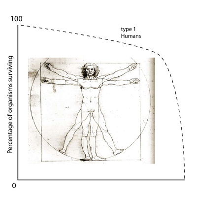
What’s a survivorship curve? Survivorship curves generally fall into one of three typical shapes. Click on the images below to learn more about each type of curve.
- apes_3.a_image_typeisurvivorcurve
Organisms that exhibit Type I survivorship curves have the highest probability of death in old age.
- apes_3.a_image_typeiisurvivorcurve
Type II survivorship is an intermediate curve that suggests that such species have an even chance of dying at any age.
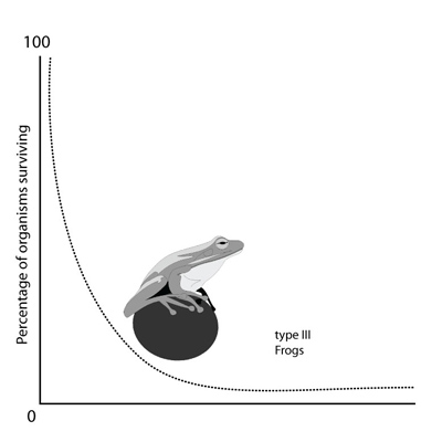
- apes_3.a_image_typeiiisurvivorcurve
Species with Type III survivorship have the greatest probability of death at young ages. In other words, these species suffer very high mortality of eggs and young.
Type I survivorship: Organisms that exhibit Type I survivorship curves have the highest probability of death in old age.
Type II survivorship: Type II survivorship is an intermediate curve that suggests that such species have an even chance of dying at any age.

Type III survivorship: Species with Type III survivorship have the greatest probability of death at young ages. In other words, these species suffer very high mortality of eggs and young.
Lab: Life Tables and Survivorship Curves
In this lab, you will first examine the life table of Dall sheep to learn more about life tables and survivorship curves. Then comes the data collection! You’ll collect and compare age-specific mortality data from gravestones in two cemeteries in your community, one representing a historical population, and the other a modern one. These data will be used to construct life tables and graphically illustrate survivorship and mortality rates. Comparisons of the two populations will give you insight into the changes that occur as a human population undergoes a demographic transition.
 Lab Objectives:
- Interpret a life table for Dall mountain sheep.
- Construct a life table for two human populations (historical and modern).
- Produce and analyze graphs using survivorship and mortality data.
- Make inferences about past and present human populations based on survivorship curves and life tables..
Lab Materials:
Before you begin this lab, make sure you have all of the materials listed below ready to be used.
- Lab Worksheet
- Calculator within a spreadsheet application
If your were doing this investigation in the field, you would also need the following items:
- Data Field Tally Sheet
- Pencil
- Clipboard
- Calculator or calculator within a spreadsheet application
Please read the additional instructions on the assignment page in Schoology.
*adapted from Environmental Literacy Council at http://www.enviroliteracy.org/pdf/materials/1245.pdf
Lab: Procedure Part A:
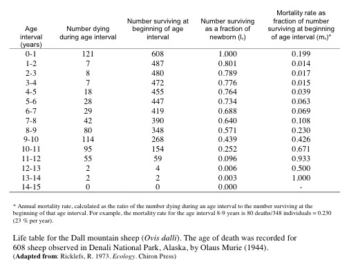
Dall mountain sheep (Ovis dalli) live on Mt. McKinley, Alaska. In 1944, naturalist Olaus Murie collected the data shown below for a cohort of Dall mountain sheep at Mt. McKinley in 1944. Using the data shown below, answer questions 1-5 on your lab worksheet. Create a graph to insert into question #4.
Lab: Procedure Part B:
Now that you’ve explored a life table and discovered the information we can obtain from a life table, it’s time to collect your own data! For this exercise, you will need to visit one historical cemetery and one modern cemetery to collect data on the gender and age of death of at least 100 people. There are many ways for you to collect this data described below. Click on the methods below to learn more about each option of collecting data.
If you have chosen to collect data from cemeteries in your community, make sure you take your clipboard, pencil, and the data field tally sheets. Follow the instructions below as you go about collecting your data.
- Obtain permission, if necessary, to visit the cemeteries, burying grounds, or churchyards you plan to collect data from. It is very important to remember that cemeteries are sacred places. Do not act disrespectfully or disturb the gravesites or monuments. Be especially considerate if other people are visiting the cemetery.
- Record the gender of the deceased and age at death on the field tally sheet for the appropriate cemetery (historical or modern). Total each age interval in each gender.
- It is important that you sample at least 100 graves each of males and females. Bring a friend or a family member if possible to help you collect this data. You could also work with a classmate to split up the data collection. Separate your populations between the 18th, 19th, and 20th centuries, if possible.
- Do not count any graves that are not legible (no guessing!).
 Visit one modern and one historical cemetery in your community and collect data on at least 100 graves each of males and females (50 modern, 50 historical). Separate your populations between the 18th, 19th, and 20th centuries, if possible.
 If a suitable historical cemetery is not available in your town or city, data for a colonial cemetery in Groton, MA, is included in this document. You will only need to collect data in your own community from a modern cemetery.
 If you don’t have access to any cemeteries in your community, you can collect mortality data from newspaper obituaries, church and funeral records, public libraries, town historical societies or museums. Additionally, there are numerous websites that have cemetery data posted, a few options are shown in the links below.
New Woodstock Cemetery: A list of all the 1,624 people buried in New Woodstock Cemetery, Cazenovia, NY, with dates.
Billion Graves: Filter Cemetery Results by Region - Country, State, County. Pick a Cemetery and view photos of tombstones.
Find A Grave: Database search from a number of cemeteries.
Genealogy Center: Cemetery data, sorted by year, from several cemeteries.
If you don’t have access to any cemeteries in your community, you can collect mortality data from newspaper obituaries, church and funeral records, public libraries, town historical societies or museums. Additionally, there are numerous websites that have cemetery data posted, a few options are shown in the links below.
New Woodstock Cemetery: A list of all the 1,624 people buried in New Woodstock Cemetery, Cazenovia, NY, with dates.
Billion Graves: Filter Cemetery Results by Region - Country, State, County. Pick a Cemetery and view photos of tombstones.
Find A Grave: Database search from a number of cemeteries.
Genealogy Center: Cemetery data, sorted by year, from several cemeteries.
source: http://commons.wikimedia.org/wiki/File:
Seattle_Public_Library01.jpg
Lab: Data Analysis
Now that you’ve collected all that data (or obtained the data online or elsewhere), let’s get to work making a life table and survivorship curve. Then you can make comparisons between groups and inferences about the populations studied.
Using Excel or a similar data analysis program, construct life tables for the total populations surveyed (historical and modern). You may use the attached Excel Spreadsheet. Enter the number of graves of each age class into columns B and C (No. of deaths, dx) for each gender (type over the exisitng example numbers in blue) on the Historic and Modern Cemetery tabs. The data will be updated automatically in the cells, and on the Comparison tab and Survivorship Graph.
Survivorship is the number that survives at the beginning of the age class. Mortality rate is calculated as the ratio of the number dying during an age interval to the number surviving at the beginning of that age interval. For example, the mortality rate for the age interval 8-9 years is 80 deaths/348 individuals = 0.230 (23% per year).
Life Table Variables
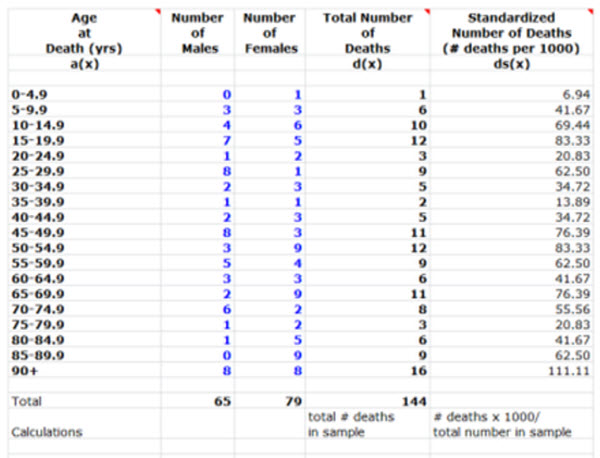
a(x) Age at Death
d(x) Total number of deaths in that age category (male + female) [total number deaths in sample]
ds(x) Standardized # of deaths per 1,000 [# deaths x 1000/ total number in sample]
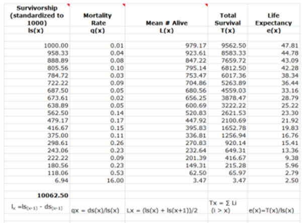
ls(x) Survivorship per 1,000 [1,000-ds(x)]
q(x) Mortality Rate = ds(x)/ls(x)
L(x) Mean number of living indivduals Lx = [ls(x) + ls(x+1)]/2
T(x) Total Survival Tx = ∑ Li (i > x)
e(x) Life Expectancy
Life Table Example - Page 1
Life Table Example - Page 2
When you’ve constructed the life tables and survivorship curve, answer questions 6-15 on your lab worksheet. You will need to copy and paste the tables and graphs from Excel into your lab worksheet, or attach the completed Excel Spreadsheet in Blackboard along with your completed lab (including lab worksheet, your life table and survivorship curve) to the Lab: Life Tables and Survivorship Curves link for grading.
![]() Reflection: Life Tables Lab
Reflection: Life Tables Lab
In your science journal, describe your experience conducting this fieldwork. What was difficult for you? What did you enjoy about it? Were there any surprises in your final analysis of the data?